BIG-IP Design System
Back to ProjectsCustomer centricity is a central tenant of our corporate transformation and “we obsess over customer needs” is highlighted as one of our five core behaviors. Learning, confirming and refining our understanding of our customers drives better decisions. Better decisions results in more useful products for customers. Customer experience transcends any single product, service or system. It also transcends the phases of our product lifecycle.
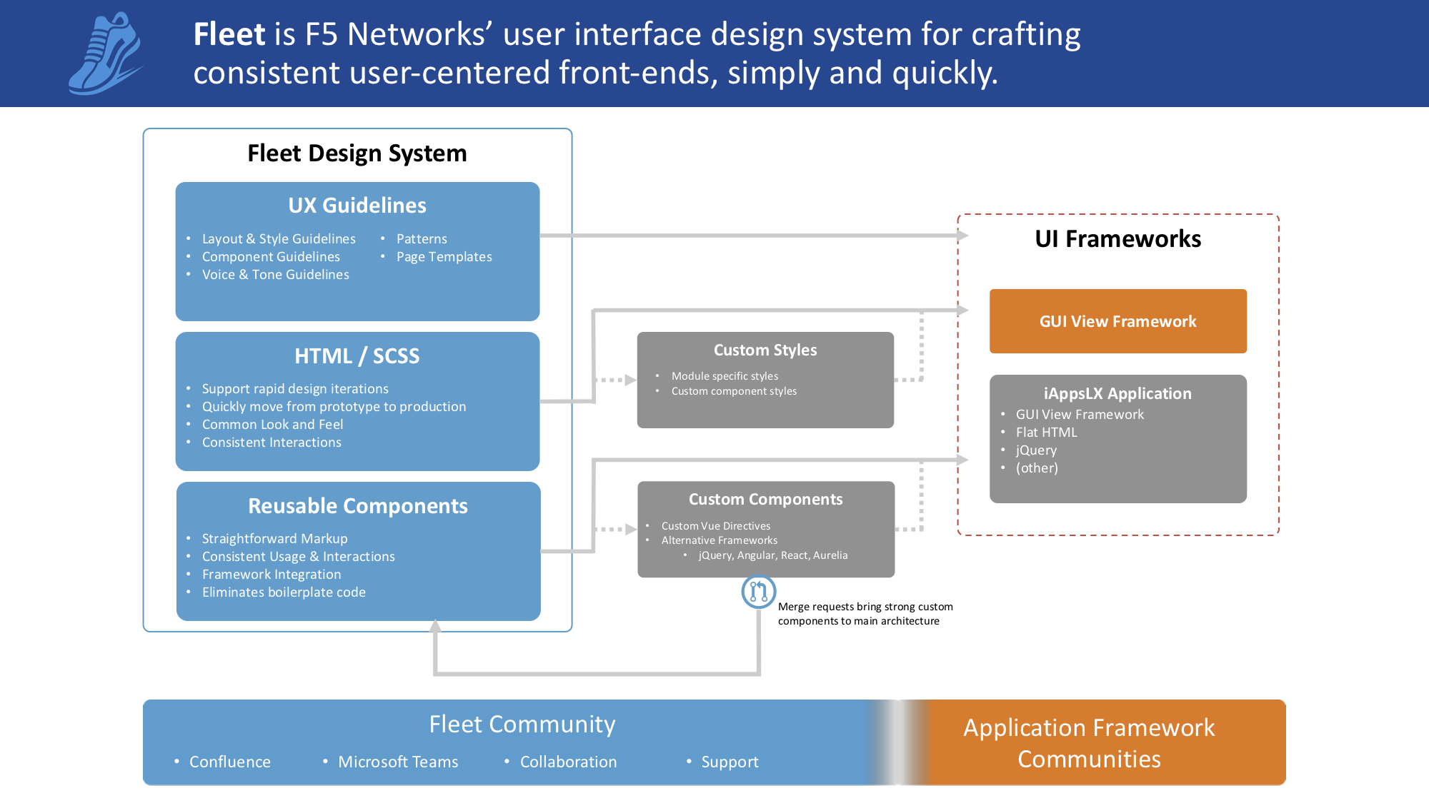
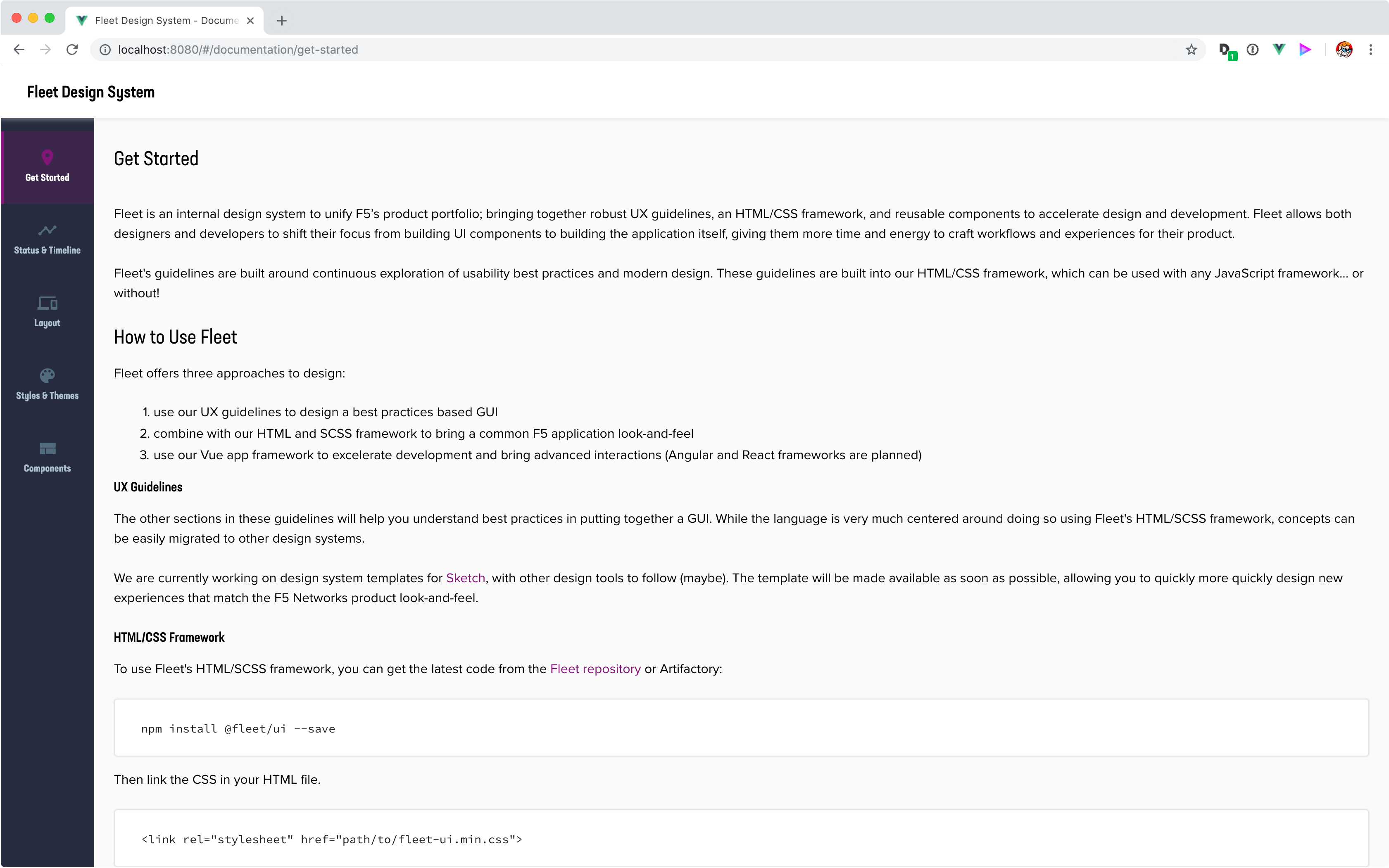
Fleet is an internal design system to unify F5's product portfolio, relying on robust guidelines and reusable components to accelerate development. The system allows designers and developers to shift their focus from building UI components to building the application itself, giving them more time and energy to craft workflows and experiences for their product.
My Role
As the primary contributor, Fleet is my daily priority. I am the product owner, principal designer, principal prototype developer, and loudest evangelizer for the design system. I lead and coordinated all facets of the design and development of Fleet, including: project scoping, requirements gathering, technology analysis, pattern and interaction flow definition, documentation, prototyping, and development.
It is my responsibility to prioritize, define, and task design elements among junior designers, developers, and testers, who contribute to Fleet on a part-time basis.
The Problem
The F5 product space had no rationale, design standard or cohesion in the way experience patterns were used across products, or even within a single product! As a result, designers and developers often invent new patterns, ignoring existing precedence, causing a disjointed experience both across product lines and within a single product. Designers have been struggling with the notion of consistency and maintaining visual unity across visual elements and patterns, each group reworking artifact designs or creating brand new patterns.
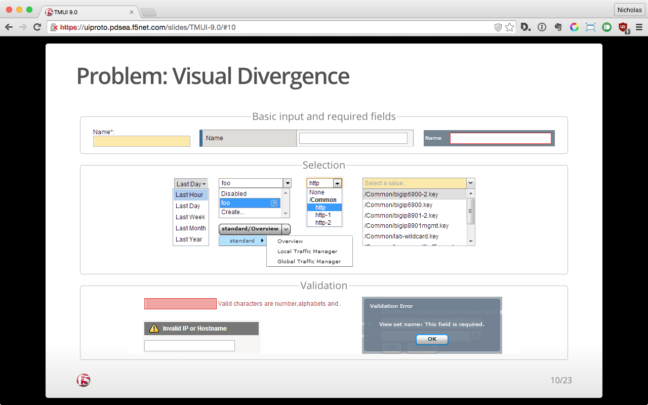
Developers further struggled with an ever-changing technology landscape. Working within an environment developed more than 15-years prior, developers frequently wedged new technologies into the framework in order to achieve more modern capabilities. In each instance reworking the look-and-feel, sometimes to best match the existing patterns, sometimes not.
Our Goals
Our goal is to create a rationale, usage standard, and logic around common elements and patterns used through company wide products.
Not only did this mean making sure we supporting the design system itself, but that we made sure to allow developers to easily extend the design system to meet new needs that we could not foresee. A formal process for contributing back into the design system was set up, making Fleet a true company wide design system - not just our own.
Being framework agnostic was another primary requirement. Varying product technologies and application sources prevent us from forcing a single UI framework (rightfully so). Fleet had to be able to span any product, any framework, and any skill level.
Lastly, in addition to the traditional deliverables we made sure to wrap a community of practice around the design system. Knowledge was not left to tribal silos or hard to fine wiki pages. Instead we make sure to be known and available to those using the system.
Evolution
Fleet's visual aesthetic and framework elements have evolved multiple times during its development. Creating a design system for easily maintaining visual consistency with the traditional product look-and-feel was Fleet's first goal. The system's earliest form started with the Advanced Firewall Management and continued its course in other applications including Local Traffic Policies.
We began to move Fleet into a more modern look-and-feel with the Dashboard Refactor and Redesign, with small tweaks made based on lessons learned while designing for Network Map Redesign.
Fleet has recently gone through a significant refresh. New product development is allowing us to introduce changes aligned around modern interaction patterns, instead of historical alignment. These changes are illustrated below, and are at the center of the Modular BIG-IP GUI Redesign.
Deliverables
Style Guide
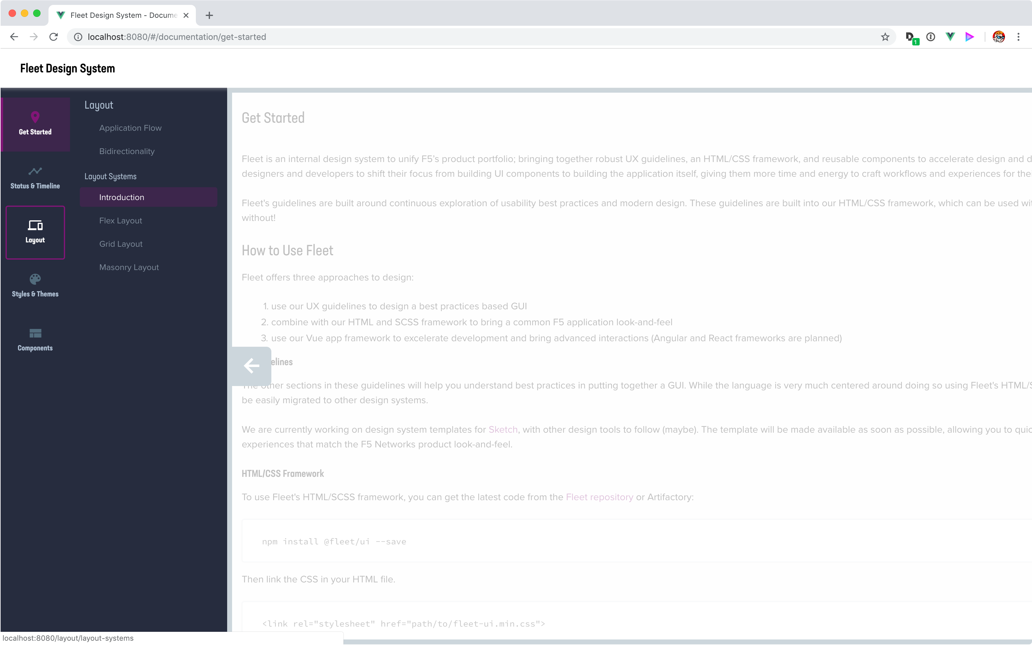
The most complex and most important part of the Fleet Design System is the Style Guide. The guidelines are an all encompassing reference, which included many of the familiar Human-Interface Guideline topics:
- Layout and style guidelines
- Component usage best practices
- Page templates
- Reusable patterns
- Voice & Tone guidelines
- Accessibility guidelines
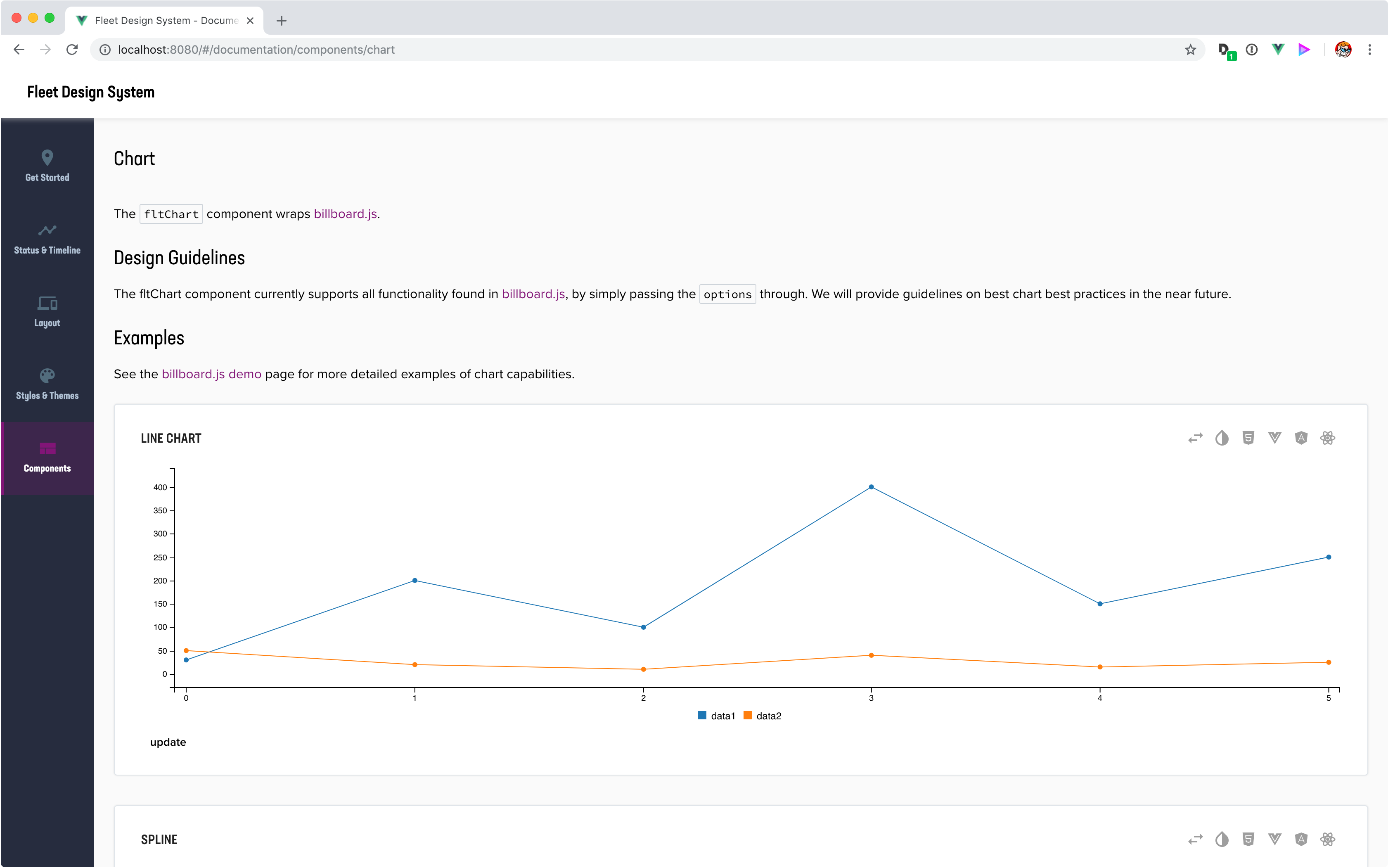
It also serves as a development resource. Each component page provides the HTML slug required for the SCSS to properly format it, allowing developers to reference the DOM for either a copy/paste into a static page, or creating a new UI framework component. A reference for each VueJS, and other, reusable component is also provided - giving the developers details on how to properly reference each component property.
We made sure to write the guidelines using Fleet itself. This allows developers and designers to see the patterns in action as they're reading about them and understand how they work together in a live application.
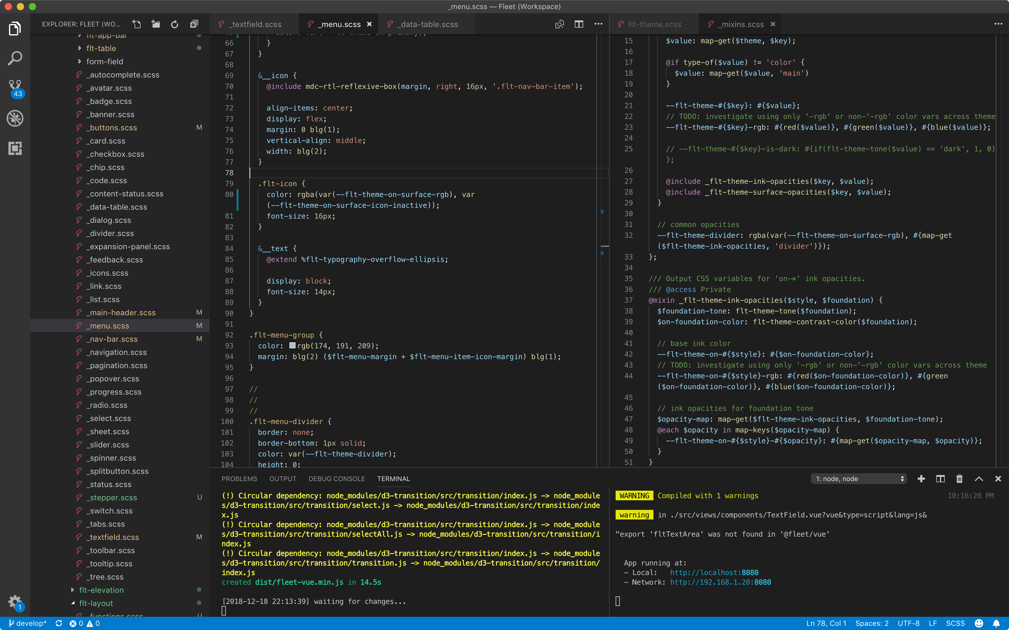
HTML and SCSS
Because Fleet is designed to work across multiple products it must be framework agnostic. While some previous, and some parallel, design system efforts locked themselves into a single UI framework (e.g., React), the Fleet components and patterns were designed to be seperate from any UI framework dependencies.
This was important because of plug-in technologies available within the BIG-IP product, specifically iApps LX. It would not be appropriate for us to force contributors to select a specific UI framework, due to preference or skill level. Not locking in developers provides greater adoption incentive.
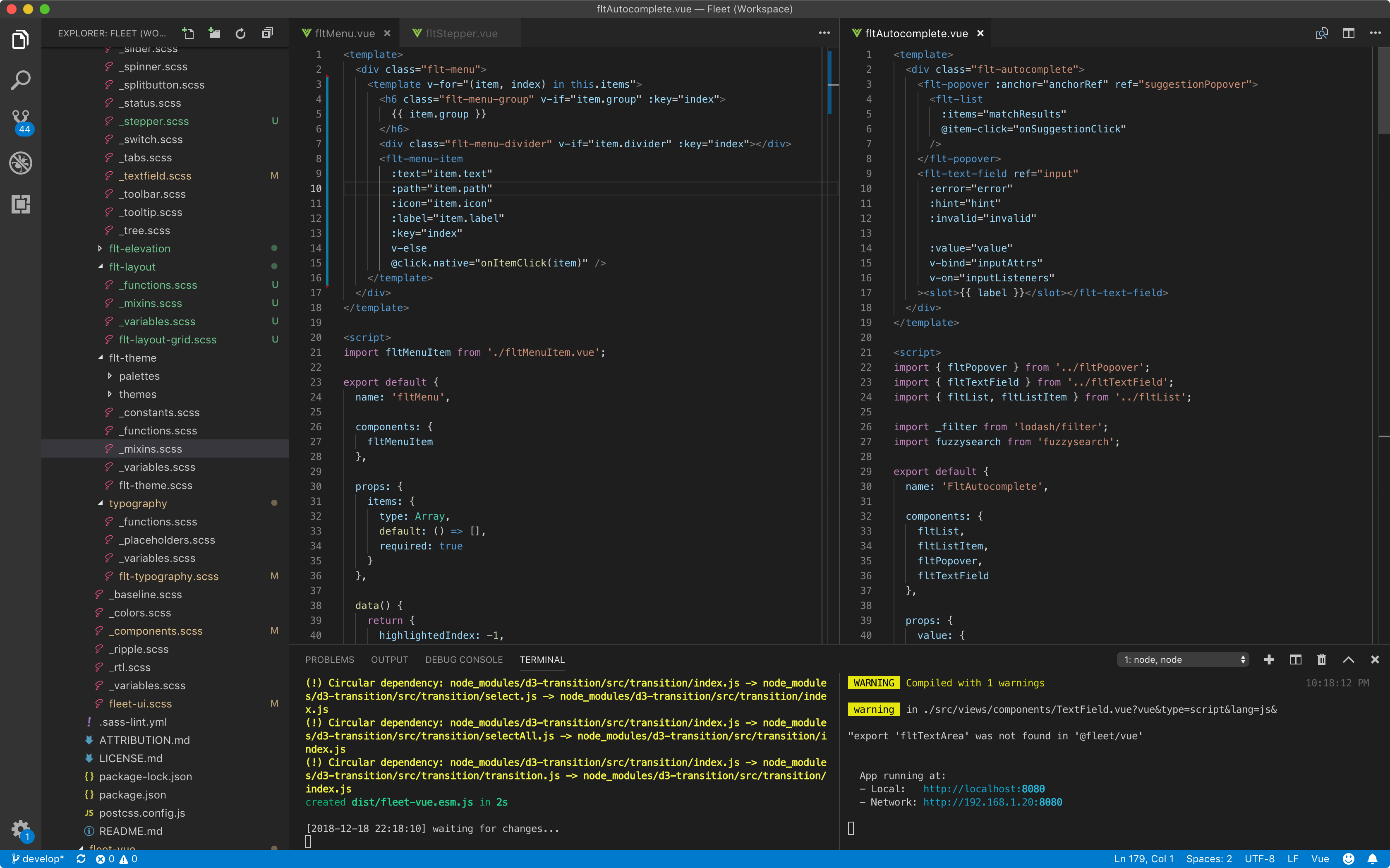
Reusable Components
Reusable components allow Fleet to avoid redundant development and testing, minimize rework, and maximize reuse across projects through a federated development and commonly managed set of UI components.
VueJS was selected as the initial framework, because of that framework's use in the Modular BIG-IP redesign effort. These components provided developers a way to more easily code simple components, and open up the landscape to more complex components such as Autocomplete and Graphs.
Additional frameworks, including React and Angular, are planned; using the VueJS components as reference.
Rollout
We didn't have the luxury to build everything at once, but we also wanted to avoid providing Frankenstein releases that would damange the user experience and hinder adoption. In the end we linked the atomic design strategy to the deployment schedule of our Modular BIG-IP redesign. This allowed us to incorporate design changes at the 'atomic' level for the initial releases; working through 'molecules' and 'organisms' on a needed basis.
Documentation has suffered under this model, because of the face pace of development and the availability of other community tools. This is unfortunately, but documentation is catching up as resources allow.