Fleet Design System
Back to ProjectsSummary
I spearheaded the development of Fleet, VMware Tanzu's comprehensive design system, to unify a rapidly unified product portfolio under a consistent visual language. By establishing operational processes and leading the implementation, I helped drive successful adoption across the organization, setting the stage for sustained growth and improved user experience.
Role
Design System Lead
Company
VMware
The Problem
A recipe for inconsistency.
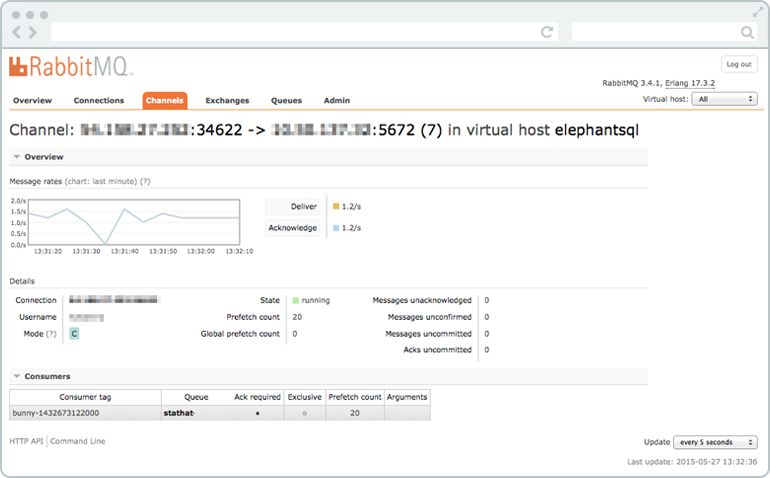
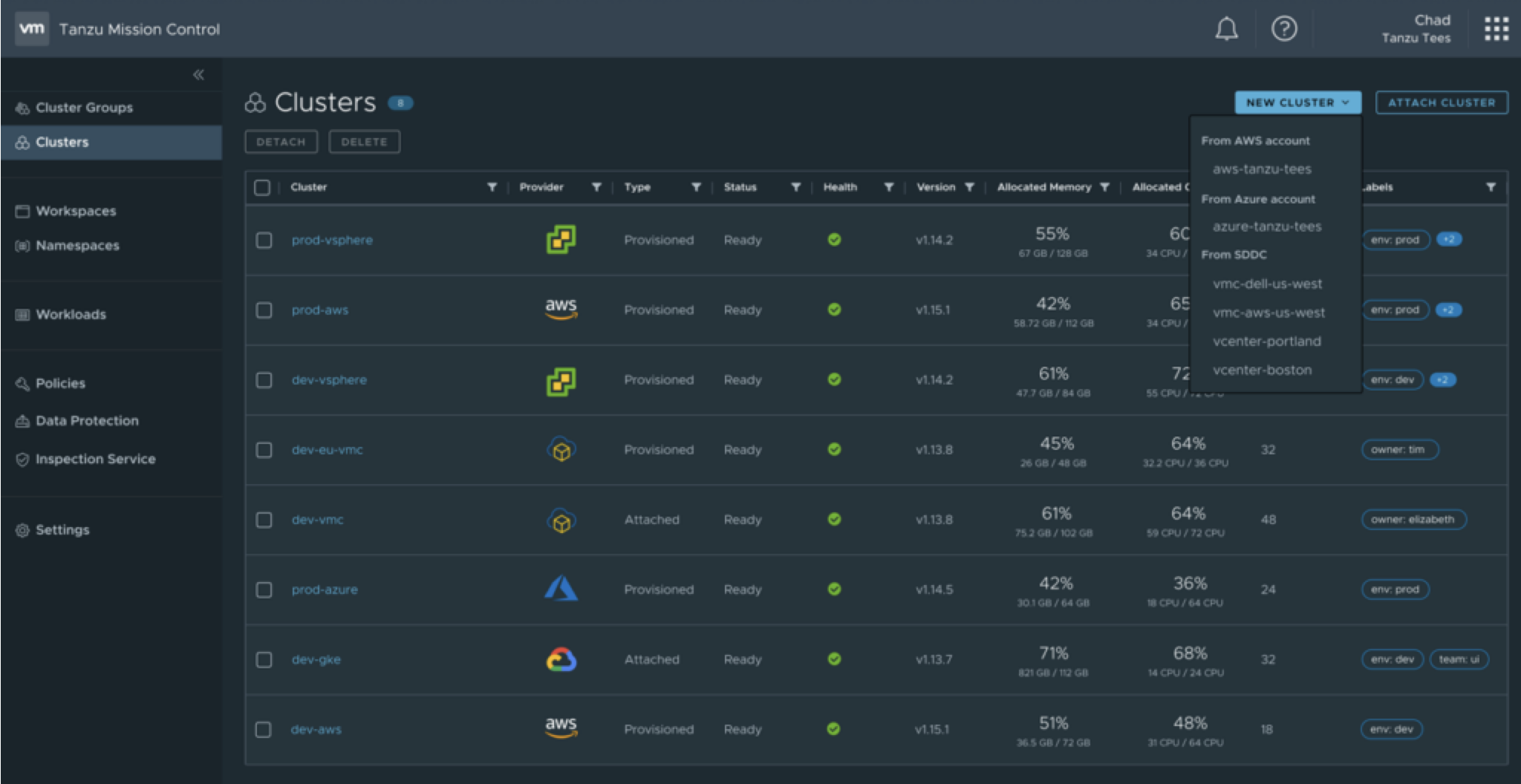
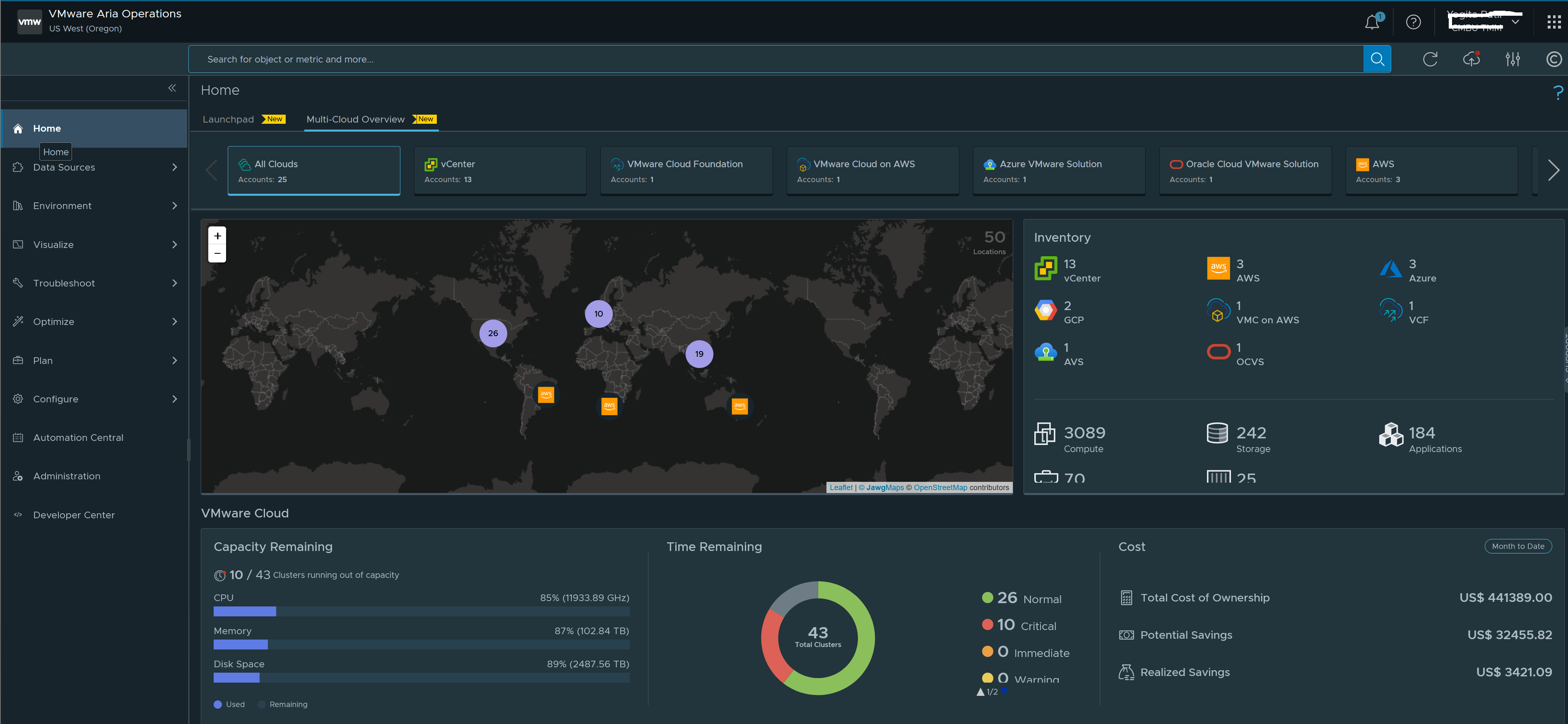
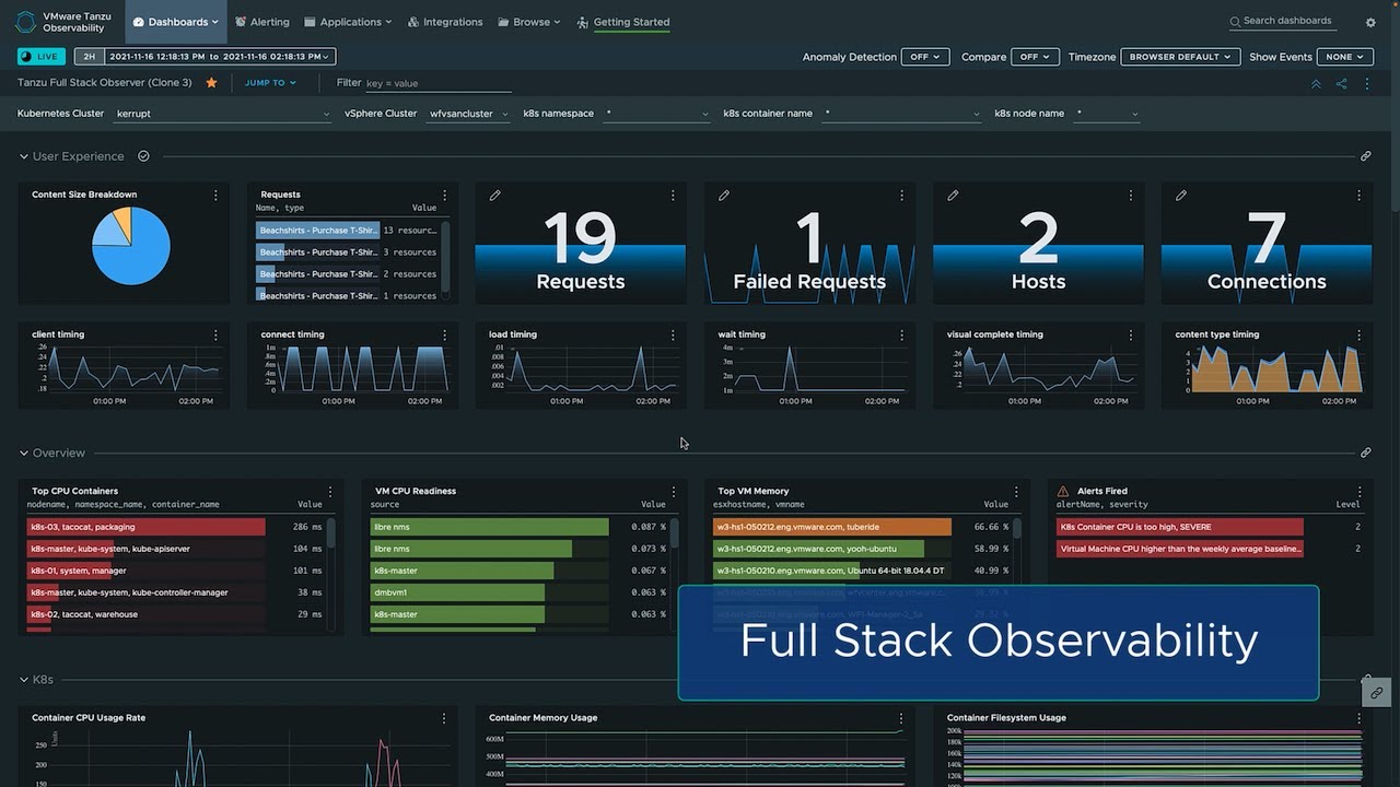
The Tanzu product umbrella expanded quickly, bringing in new products that lacked a shared visual language. This resulted in several key issues:
- Product teams using different frontend technologies, causing duplication of functionality across frameworks.
- No centralized source of truth for engineering, leading to developers unnecessarily duplicating solutions.
- Lack of centralized design guidelines, making it difficult for designers to maintain visual consistency.
- Gaps in accessibility compliance between products.
These inconsistencies compounded as more products were merged into a single product experience, creating a fragmented user experience and significant barriers to entry for customers.
Feature first thinking.
Without a dedicated design system team, product teams worked on elements as needed to support their feature requirements. This drove a deep need to ensure teams were aligned, informed, and all voices were heard throughout the design process.
Continued feature development also created a moving target. Product velocity continued as we sought to both align existing patterns, while also enabling designers and introduce new patterns necessary to solve user needs.
Solution Framing
Leading the charge.
As the lead, I was responsible for developing and executing the plan to create Tanzu's design system. I established operational processes, drove implementation, adoption, and advocated for the system during design and development reviews. I collaborated with designers and developers to identify and address new component and pattern needs.
 Design TeamI ensured that contributing designers had clear direction and guardrails, but were able to explore new directions.
- Design StakeholdersI was responsible for presenting design solutions to leadership, eliciting feedback, and ensuring a common perspective from the top.
- UI StakeholdersI ensured frontend developers were part of the Day 0 conversation, offering insights and ensuring a consistent understanding across disciplines.
Defining the system's goals.
To focus designers across the different products it was important to have clear goals, aesthetics, and values. These design pillars ensured that the design system represented our shared vision of what Tanzu should be.
- Distinctly and recognizably Tanzu
- Shared DNA with Broadcom and VMware
- Fresh, but not too trendy or abstract
- Simplify complexity
- Meets enterprise expectations
Creating a distinct brand.
I worked with the Branding team to frame what it mean to be "Tanzu". Together, the two teams defined a set of brand values that helped guide create a truly distinctive Tanzu experience.
- Simplicity
- Trustworthy
- Informative
- Efficient
- Performant
- Reliable
- Responsible
- Dependable
- Competence
Steps to Success
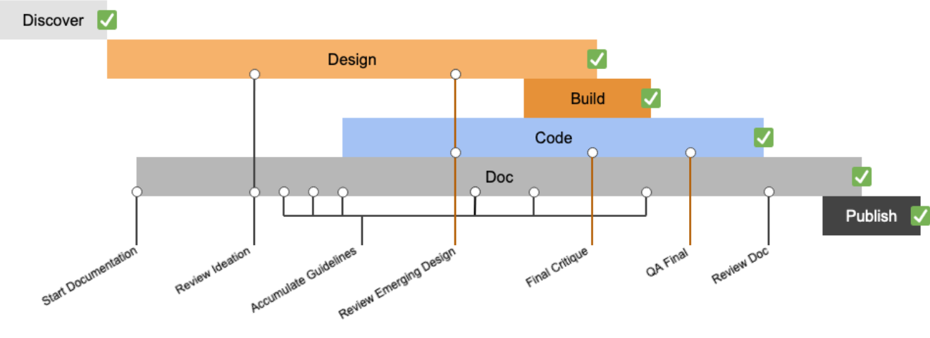
Estabalishing a clear process.
With multiple products and just as many design processes attempting to unite, the ability to manage and coordinate the number of assets and updates to those assets was daunting. Both design and engineering teams would often have duplicate solutions to the same problem, creating design inconsistencies and development bloat.
By establishing a clear process and cadence, emphasizing responsibility, accountability, and streamlining collaboration, I was able to align the different teams.
Auditing the current experience.
Understanding where we were was an important to getting to where we wanted to be. Performing an audit to understand the degree of divergence in common patterns allowed us to begin to identify the scale of design and tech debt.
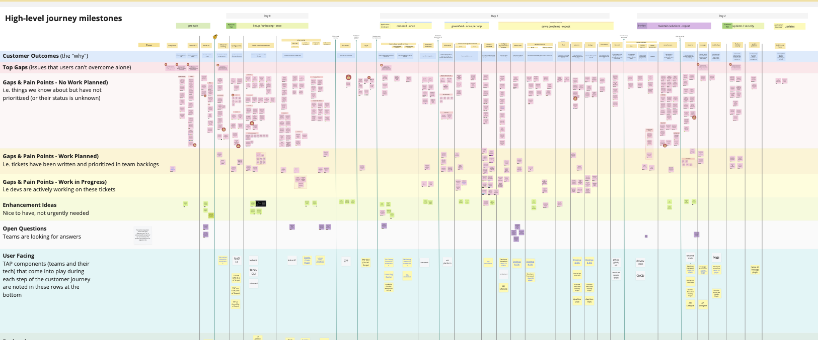
Charting the user journey.
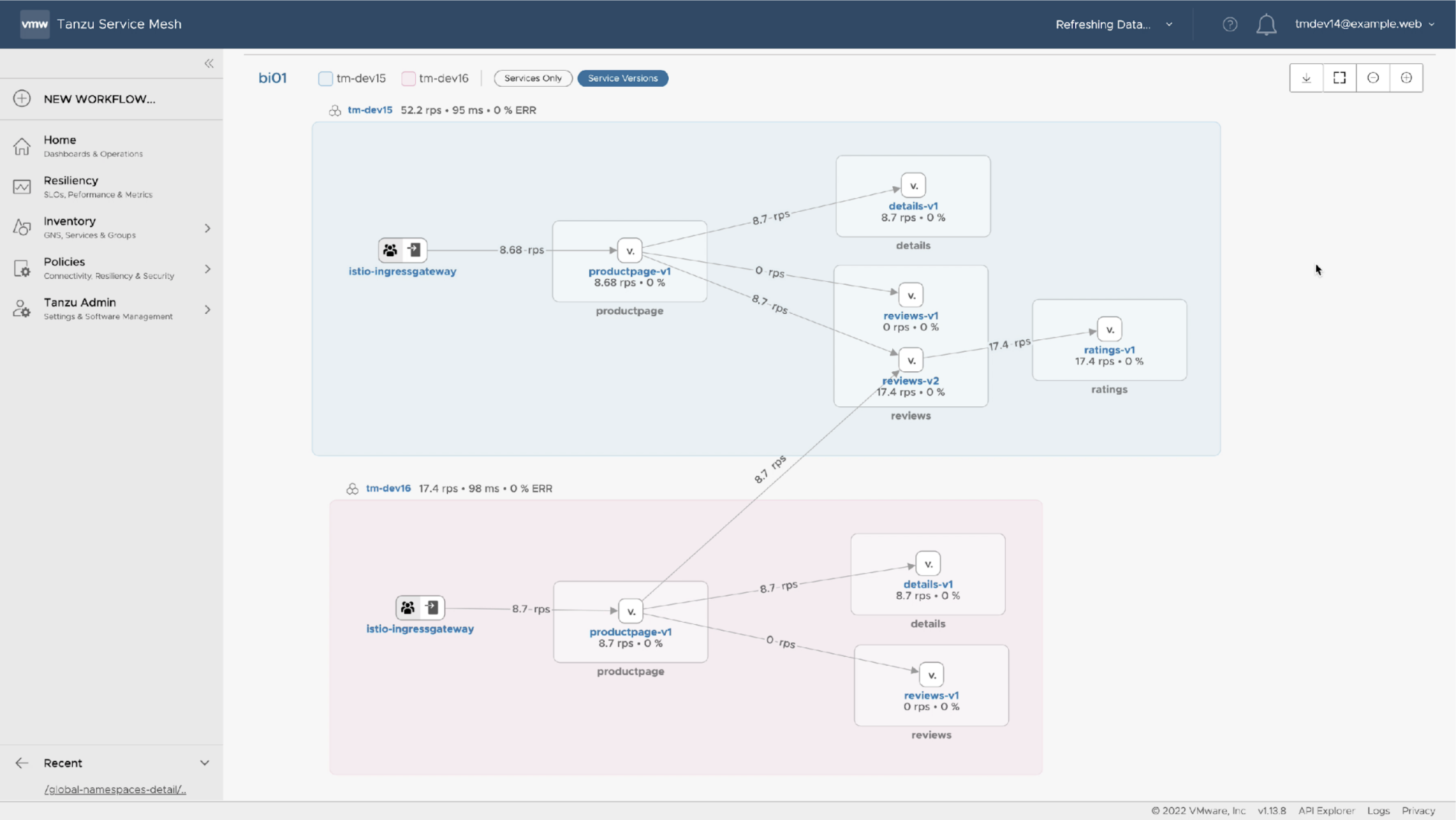
Our efforts creating a product-agnostic Tanzu customer journey map enabled me to better scope GUI needs. By understanding the workflows, and user expectations, I was able to better focus priorities and conversations around design system components and patterns.
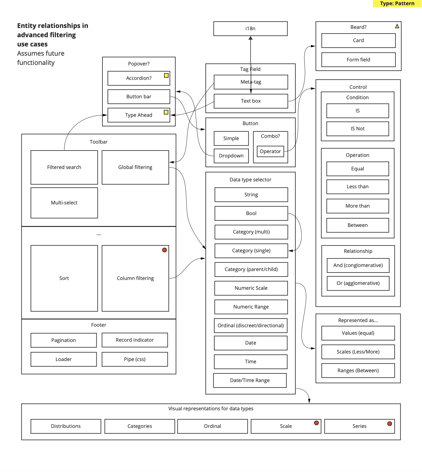
Framing components in a common language.
By providing clear visual representations of entities, attributes, and relationships during early component design, entity diagrams established a shared understanding and covabulary that facilitates effective
Artifacts
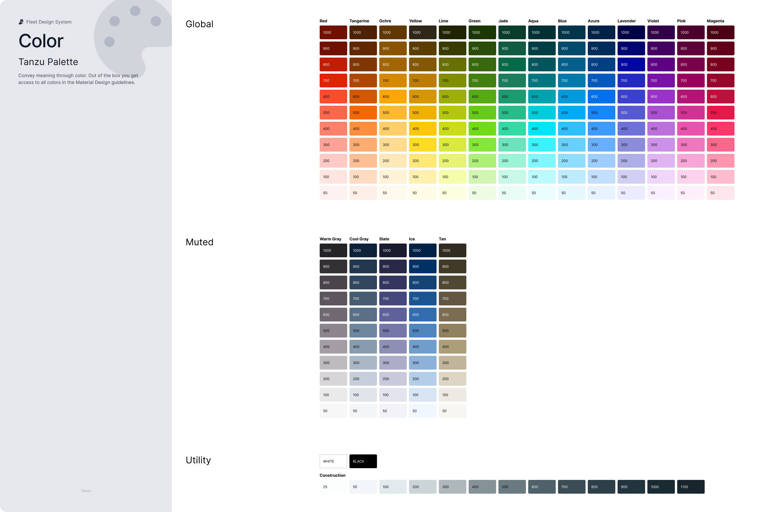
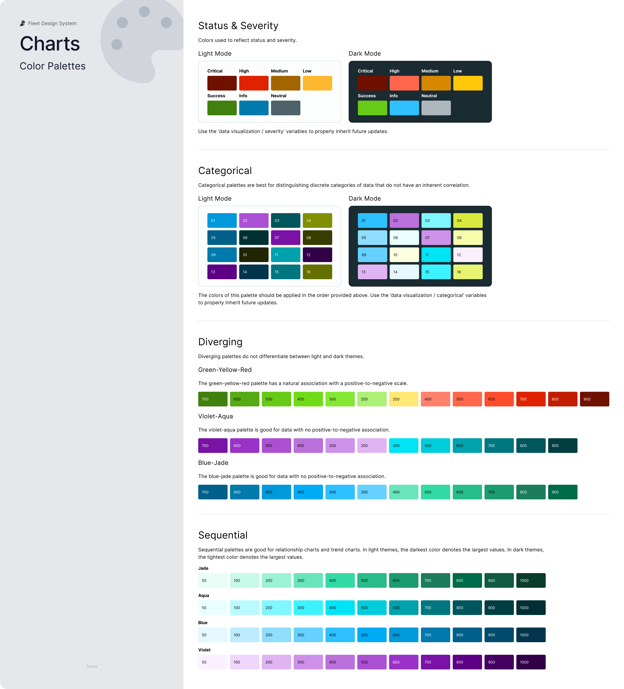
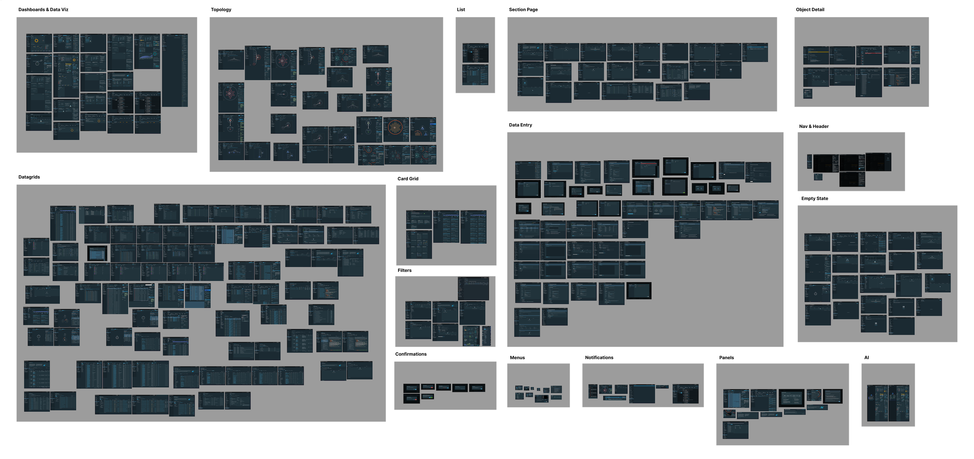
The Fleet Design Guidelines Figma file provided a one-stop shop for components, patterns, guidelines, accessibility, and all aspects designers needed to move quickly while maintaining consistency. While Figma was not the most ideal tool for this job, I was able to provide a solid resource for designers.
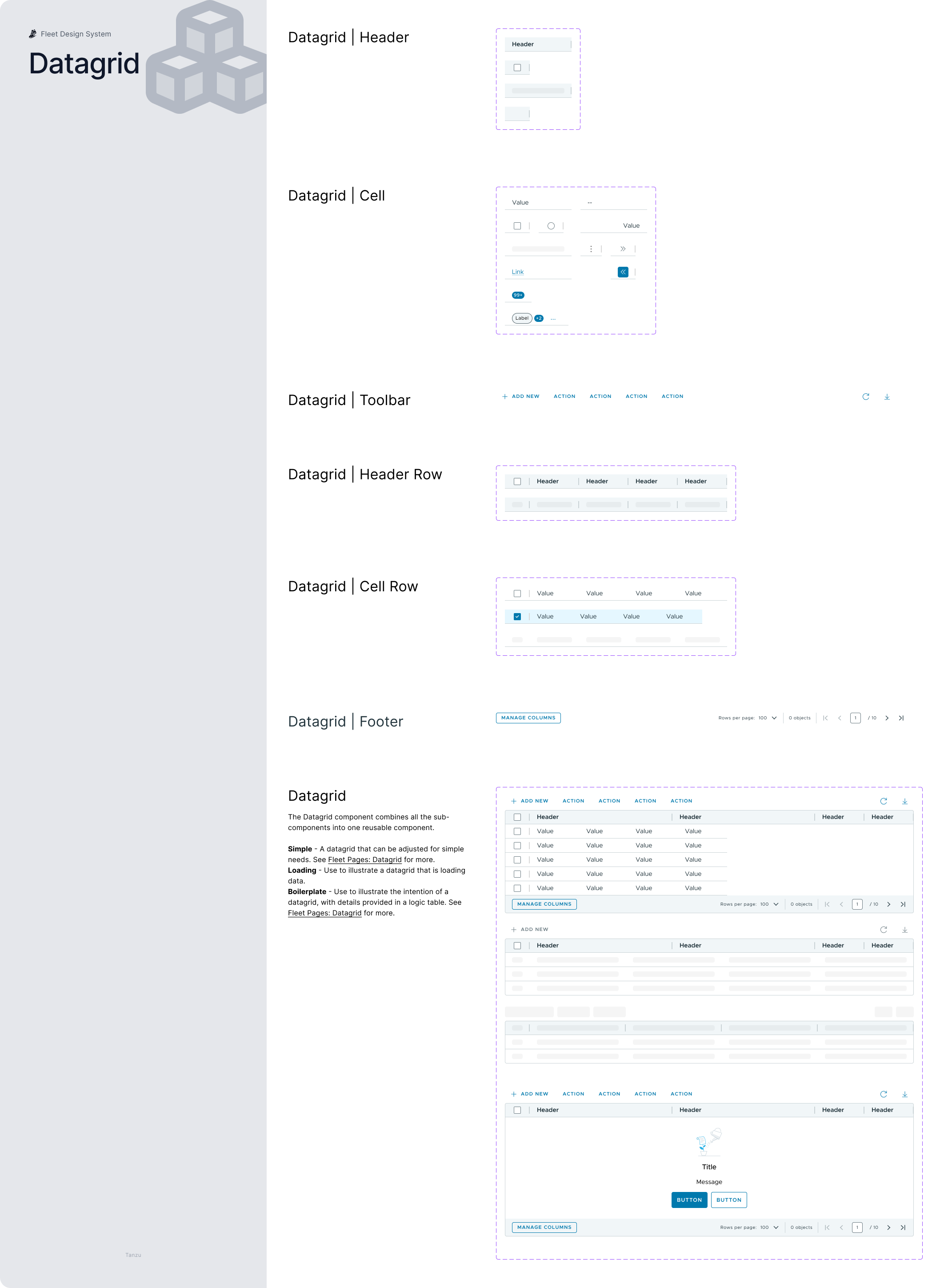
Robust, reusable, components.
I created and curated a collection robust Figma components. Working with product designers and engineers, we ensured these components met the needs of the user experience as well as the implementation.
While we stressed a best practice of avoiding detatching components, designers were empowered to do so if workflows required. I took these inputs as improvement opportunities to the system itself, continuing to improve.
Design Guidelines
Components alone do not make a complete system. We took great care in crafting robust design guidelines to inform designers how to use the components in the most consistent ways.
Patterns
Our products are not just a simple collection of components, but rather a complex interaction of numerious patterns to enable our user workflows. Documenting these patterns and helping designers understand when to use them was an important addition to the Fleet documentation.
Helping decisions
With different options available to serve similar needs I crafted a series of decision trees to clearly communicate when certain components and component variants should be used.
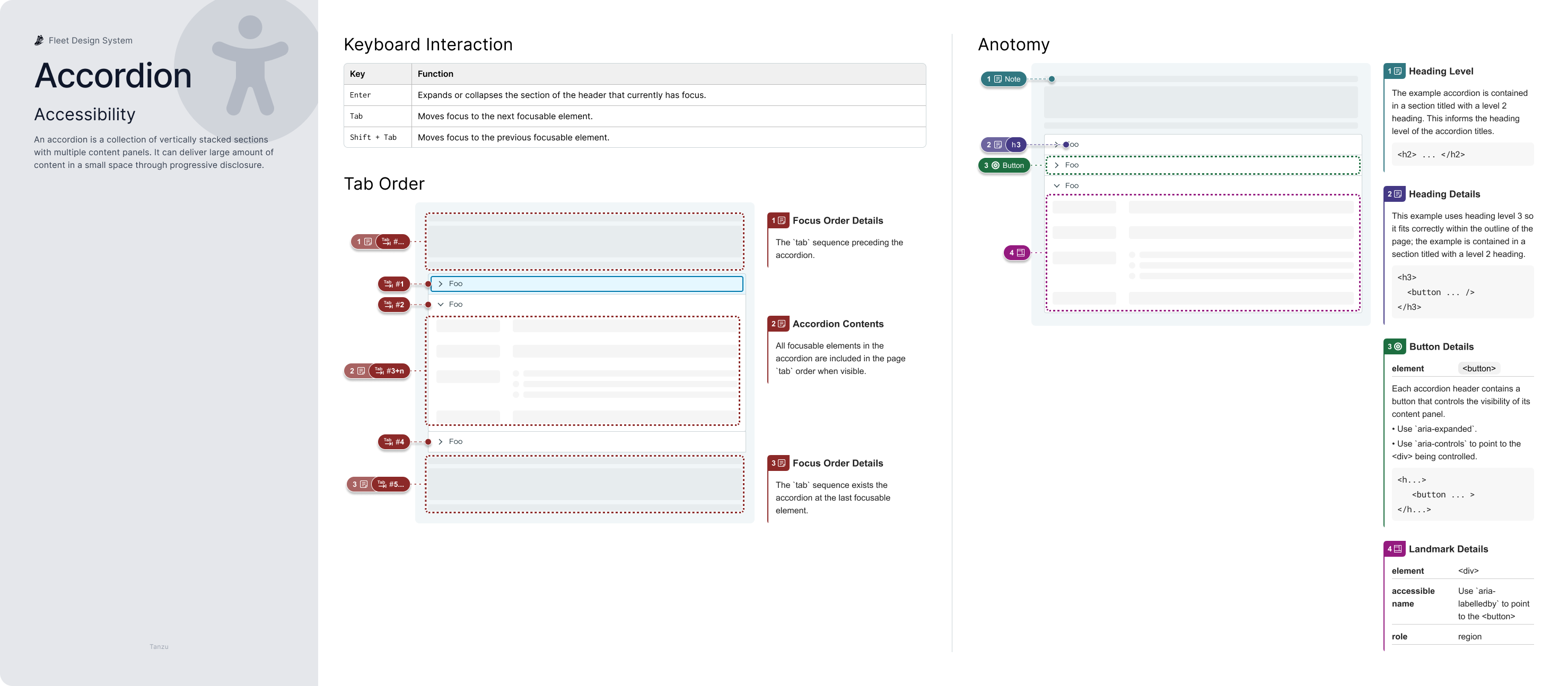
Accessibility
Accessibility is built into Fleet components whenever possible. Clear annotations for keyboard interactions, tab order, and anatomy communicate to developers how to best empower all users; these annotations also help inform designers understand how different pieces will interact as a whole.
Ensuring designers have a set of best practices readily available was also important. A designer's reference sheet for accessibility gives designers a resource for thinking inclusively.
Results & Impact
Significant results:
Fleet's unified visual language led to a more cohesive user experience across Tanzu's products.
- Consistency86% increase in design consistency!
- Time savings65% reduction in UI engineering time!
- Accessibility87% accessibility compliance score!